got a beef with the iraq war

cows that vote democrat.
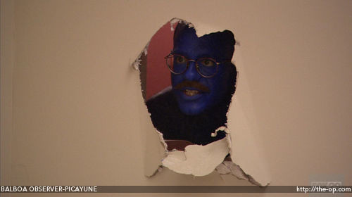
there is a blue handprint on the piller outside the door of the library. fans of the prematurely cancelled arrested development will acknowledge that we may have an analrapist on the loose.
so i got a parking ticket from the college yesterday. i was there for 5 minutes and when i got back to my car the bastard was leaving it on the eagle. they are only allowed to do this if you're been parked for more than 15 minutes, so naturally, i wasn't ok with it. i went down to the parking office and started filling out an appeal, and then noticed that on the ticket they had gotten my license plate number wrong. that is when i had this exchange,
me: this isn't my license plate number, can you really make me pay this?
secretary: [taking out a pad of paper] what's your real number?
me: i'm not telling you that now!
Today, i got back a field theory homework. But instead of any specific criticism of what I did wrong on Problem #4, i got this vague profundity, certainly the most discouraging thing I have ever been told by a problem set:
Too small? Here's a close up,
Rarely has a returned homework seen into the very depths of my tormented soul.
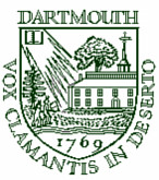
this is an excellent article written back in the mid-nineties about my college's sub-par sheild, and all the typical dartmouthesque bungling and incompetance that went into producting it. found via dartmo, an excellent site on the college's architechure which also explains the monstrosity in front of fairchild. basically, the upshot of the article is that our school seal, which most of us already consider somewhat inadequate aesthetically, is in fact, really, truly awful and goes on to innumerate the reasons why. the main ones are that a sheild should never be a line drawing, and that the image itself is of, like, you know, naked indians walking towards a symbolic cross (i mean, come on!)--which continues to promote the falsehood that dartmouth was at any time a missionary institution (or primarily for native americans for that matter). the notion that we should hang on to it simply for the reason that it is somehow traditional is debunked by the observation that it was only created in 1944. a bit of basic sheild design stuff:1. the placement of colored objects on a contrastingly colored field is fundamental to good heraldic design, since it allows a coat of arms to be easily recognized. the dartmouth coat of arms however, exists only as a line drawing...
2. also, a well-designed coat of arms uses a limited number of objects to make a symbolic statement. these objects should never be crowded into a vista, or act as filler, or disappear off the edge of the shield, as they do in the dartmouth coat of arms.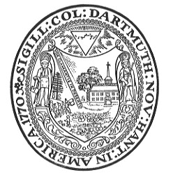
the reason for our chaotic arrangement seems to be the orginal bizzaro seal that you see on only the most official of documents, which did actually date from an early point in the college's history. as the author explains, plenty of places have one of these, but no one tries to adapt it for the heraldic sheild since it looks terrible! (a seperate article, (also via dartmo) points out how weirdly dressed the people in there are and how it is impossible to figure out what they are supposed to represent). the common sheild itself is simply too complicated to form much of an impression in the memory. my own veiw on logos is that they should be reproducible by 6-year-olds without becoming unrecognizible.
worst of all is that the man commissioned to design our coat of arms did so only 'under protest,' saying how unsuitible the drawing was for any sort of carving, metal-casting, or mass-reproduction and how we needed to adopt a heraldic-style design for common use. for replacement, the author goes over a few suggestions that have been made over time. the best of which is his own: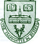
i tinted it green. i think we can all agree that it is far superior. it has a deer in it for god sake! case closed.


